Instructions
Menu Tabs
To navigate to different pages in this template, you use the menu tabs to the right. On mobile, these tabs are hidden in the menu, accessible by clicking the icon.
Your current page will not show as a button in the tabs. For example, if you are on the about page, you will not see the about page tab link. This is done using the Current class state. Keep this is mind if you wish to delete or change menu links or pages.
Recolouring Images
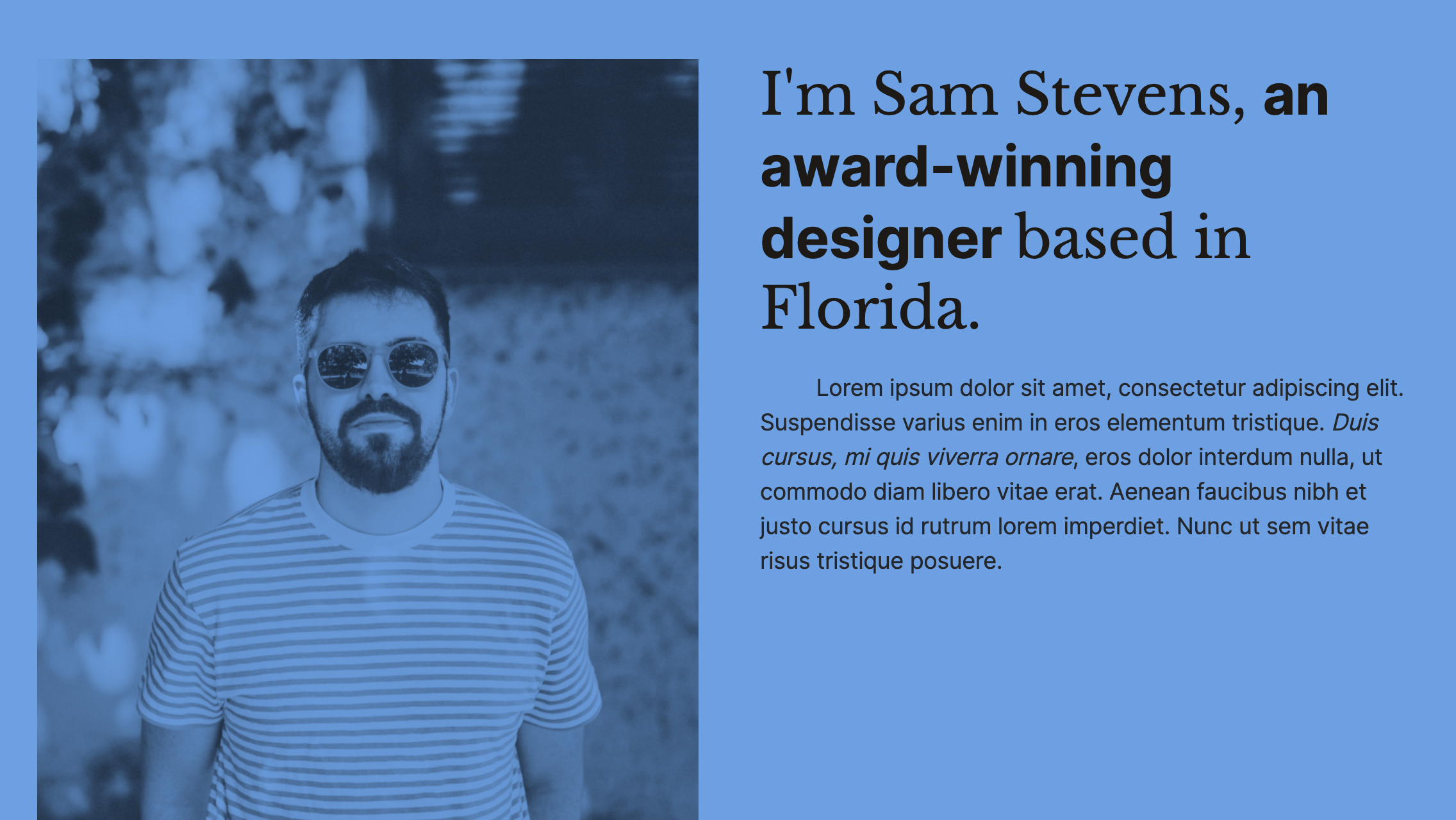
Images will use the colour of their background div with blending modes turned on. If you take any image, put it in a div and add a colour (such as the colour of the page), and then change the image blending mode to mutiply, the image will be coloured the same as the background.
Naming Conventions
I've built a naming convention system that will make it easy to edit and add new content and sections as you go through and create new pages. The layouts are built using a 12 column grid (which you can read more about here), and also using grid blocks.
I've found that these are the best ways to create complex sections and beautiful pages, without having to completely reinvent the wheel by adding in hundreds of different classes. Find out more about how they work below.
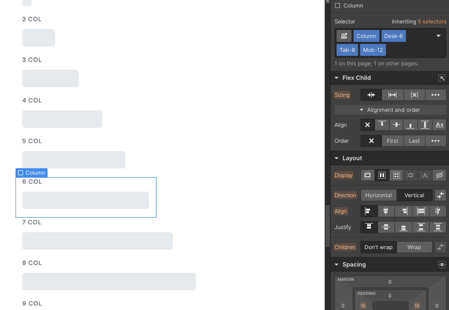
Column naming conventions
Columns are a great way to be able to build hundreds of different unique layouts, all while keeping within the same simple system.
All you need to do is set up a "Column" class, then set up the different sizes for on desktop, tablet, and mobile. It's best to build on a 12 Column layout, as this is the structure that is currently most commonly used throughout the web, and most website designs are initially built on a 12 column layout.
This is much more flexible than using the built in Column element, as if you use the built in Columns, you'll find their limitations when you get stuck building a complex layout.
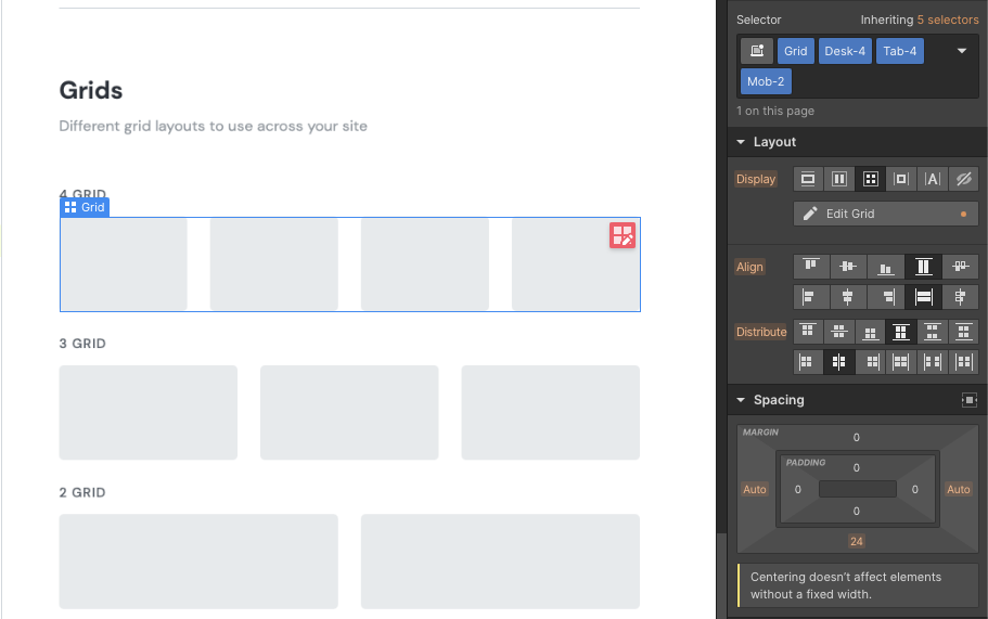
Grid naming conventions
Grids are another great way to structure content, and the built-in Webflow grids are easy to use. These layouts are great for card layouts, such as blog posts cards.
I use a very similar structure to columns, with first defining the element as "Grid", and then defining how many columns each grid section has for the different screen sizes.
By defining all grids with a main "Grid" class, you can adjust all grid sections at once if you ever need to change their margin, gap size, or even background colour.
I've created layouts for grids with 4, 3, and 2 columns, but have also defined special layouts with one side of the grid bigger than the other, such as 1-1.5 and 1-2. These can come in handy for feature or hero sections.
To find out more about naming conventions used across my templates, read this blog post on naming conventions.
Customizable to suit your brand
Feel like changing something in the template? All of our templates where built using Webflow without writing code. That means you can customize them in every way to suit your brand. Learn more about how to customize Webflow sites at Help Center
Support